
Warm White versus Colored Christmas Lights: Which Look Feels Like Home?
By Little Elves Lighting Pros · Updated
Choose warm white if you are drawn to a quiet, classic Christmas glow. Choose color if you want a playful, nostalgic or more distinctive display. You can also combine them thoughtfully. The strongest choice is the one you enjoy seeing on your own home.
The question is not which palette is more impressive. It is how the lights work with the roofline, entrance and surrounding landscape. A clear focal point and a consistent palette usually do more for a display than adding another decoration.
What warm white brings to a home
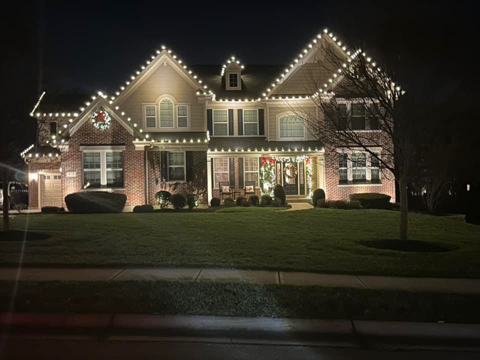
Warm white lets the shape of the house take the lead. A continuous roofline can feel calm and complete, especially when the entrance has a related detail such as an illuminated wreath.
It can also make existing decorations easier to bring together. Greenery and red bows can supply color while the lighting stays consistent. That does not mean every white bulb will look the same. Products can differ in warmth and brightness, so ask to see the proposed look rather than relying only on a label.
What color brings to a home
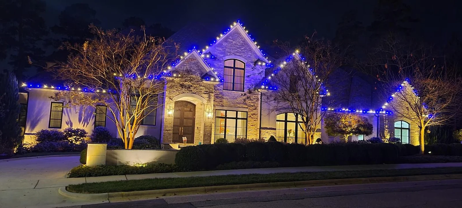
Color can make a display feel personal. You might enjoy a familiar multicolor look, a red-and-white combination or blue alongside white. There is no need to cover the whole property in different colors to make that choice clear.
Repeating a limited combination across selected features helps the eye understand the design. If every roof edge, shrub and window uses a different pattern, decide whether that variety is the joyful look you want or whether you would prefer more consistency.
Compare the direction, not just the bulb color
| Approach | The feeling | What to think about |
|---|---|---|
| Warm white | Calm, classic and focused on the architecture. | Keep the warmth and brightness consistent across visible features. |
| A limited color combination | Distinctive while still coordinated. | Repeat the same combination instead of changing the pattern at every feature. |
| Multicolor | Playful and nostalgic. | Choose where the color should be strongest and let other areas support it. |
| White with selected color accents | A familiar outline with a personal focal point. | Use the accent deliberately, such as at the entrance, instead of scattering unrelated colors. |
Let the architecture organize the display
Look at a daytime photo and identify one main focal point. It may be the roof peaks, a tall entrance or a front-facing gable. Choose the lighting that helps that feature read clearly from the street.
Then decide what supports it. Wreaths can pull attention toward the home; selected landscape elements can add depth. A roofline-only design can also be complete. You do not have to decorate the driveway, every window or every plant.
This is the useful part of choosing a lighting style: deciding what matters and what can stay quiet. A palette is easier to choose once you know where you want the eye to go.
Can warm white and color work together?
Yes. Give each a purpose. You could keep the main roof outline consistent and use a color accent at a selected feature, subject to the products and scope agreed with your installer. Ask to see the idea together before committing.
Existing porch lights, landscape lighting and your own decorations can affect how the result looks. Include them in the conversation. If you plan to keep some personal decorations, explain where they go so the proposed display complements them.
A photograph is useful for comparing ideas, but a concept cannot reproduce every detail of light at night. Product choice, placement and the surrounding light all contribute to the finished appearance.
Use real photographs carefully
Look for homes with similar roof shapes or exterior finishes in our gallery of actual Christmas lighting projects. Notice the balance between the house and the yard, the places your eye stops and which areas are left undecorated.
Phone cameras can make lights appear brighter, cooler or warmer than they look in person. Use photos to discuss direction, then confirm the proposed products and palette with the installer. Avoid choosing solely from a heavily filtered picture.
Turn your preference into a useful design brief
You do not need design terminology. A few specific observations are enough:
- “I like a warm white roofline and want the front door to feel welcoming.”
- “Our family loves color, but I want the house to look coordinated.”
- “Keep the roofline simple and help me decide whether a wreath would suit the entrance.”
- “We have personal decorations near the door that we want to keep.”
Include a clear daytime photo of the full front of your home. Show the entrance, roof peaks and any landscape areas you want considered. A short note about what you do not want can be as useful as a list of favorites.
Leave room to change your mind next season
Seasonal lighting gives you a chance to revisit the appearance. Changes to colors, products or coverage may affect the next proposal, so discuss them before installation rather than assuming they are included.
If you are also considering year-round lighting, read our comparison of permanent and traditional Christmas lights. Changing the color settings of a permanent system is a different kind of flexibility from changing a seasonal display's physical layout.